
How to Build Free, Custom Dashboards with Google BigQuery and Data Studio
Why Dashboards?
With dashboards, users can access, interact with and analyse information about their website or application. Some advantages of using dashboards are:
Better decision-making: Helps users analyse critical data at a glance.
Competitive advantage: By focusing on displaying the most crucial KPIs, you can continually align your business operations with your goals.
Real-time data: You can interact with and analyse any data almost real-time.
Out of the several dashboard software solutions available, we’ll be discussing how to build dashboards with Google Data Studio.
Why Google Data Studio?
Data Studio is Google’s business intelligence and visualisation platform that anyone can use for free to use scalable, insightful dashboards. Some advantages of using Data Studio are:
Natively integrates with BigQuery: Can be used to visualise and analyse BigQuery data easily (Data Studio also allows you to pull from several other data sources including Google Analytics, Google Ads, Youtube and more).
Free to use: While reporting software can cost up to thousands of dollars, Google offers this free solution to data reporting. (Note: The Google Data Studio BigQuery connector lets you access data from your BigQuery tables within Google Data Studio. BigQuery is a paid product and you incur BigQuery usage costs when accessing BigQuery through Google Data Studio. BigQuery query pricing provides the first 1 TB per month free of charge.)
Shareable collaborative: Data Studio works like other G-Suite applications like sheets, docs or slides so you can easily share and collaboratively build dashboards.
Interactive: Data Studio comes with several widget options, which are also interactive.
How to Create a Data Studio Dashboard USING THE BigQuery CONNECTOR
You can access Google’s official documentation for Visualising BigQuery data using Data Studio here.
Before we go into the how-to guide, we recommend the following qualifications for using Data Studio with BigQuery.
You have BigQuery API activated and configured for your application in Google Cloud (including the setup of a billing account for BigQuery).
You have a familiarity with SQL.
You have a familiarity with the data in BigQuery.
You have the appropriate permissions to add a BigQuery data source to a Google Data Studio report (the permissions applied to the BigQuery datasets also apply to the reports, charts and dashboards you create in Data Studio).
If you’ve ticked all three boxes, you’re ready to get started with creating the dashboard.
1) Create a Data Source
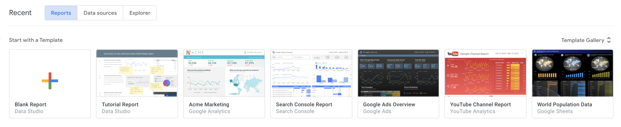
a) Click on ‘Blank Report’ in Data Studio.
b) An ‘Add data to report’ window will then appear. Click on ‘BigQuery’. If you are prompted for Authorisation, click ‘Authorise’. This action lets Google Data Studio access to your Google Cloud project.

c) You’ll then be able to view all the Google Cloud projects that you have access to. For the purpose of this tutorial, we’ll work with the public data-sets. Click on ‘Public Data-Sets’, choose a public dataset and choose a table you’d like to work with and click ‘add’.

d) You can view, add and edit all your added data sources by clicking on ‘Manage added data sources’ in the ‘Resources’ menu of the header toolbar.

e) You can choose the fields that will appear from the tables by clicking on the ‘edit’ option on the relevant data source.

For example, I can hide the ‘country_code’ field by clicking on the menu next to the field name.

2) Visualise the Data
a) Once you have added the data source to the report, the next step is to create a visualisation of the fields you want to display. Experiment by creating a bar chart. Click on the ‘Add a chart’ option on the toolbar and select ‘column chart’. Drag across the page to set the size of your chart. We’ll create a bar chart that shows the crude birth rate per country.

b) Because you are charting the crude birth rate per country, the dimension should be set to country_name. If country_name is not the default dimension, drag country_name from ‘Available Fields’ in the right hand tab onto the default dimension to replace it. In the ‘Metric’ section, drag in crude_birth_rate from the ‘Available Fields’.

c) You can customise how the chart is displayed using the ‘Style’ tab.

d) You also have the option of adding a control to your dashboard, allowing users to interact with the data.


e) If you’d like to filter your data to display a limited dataset of a field, click on the ‘Filter’ option and customise a filter. For example, I’ll create a filter to only display countries with a birth rate greater than 20. I’ll also apply this filter to the slider.


This is the dashboard that will appear to users once the filters are applied to the slider and bar chart.

3) Create a Chart Using a Custom Query
a) Creating a chart using the Custom Query option allows you to leverage BigQuery's full query capabilities such as joins, unions, and analytical functions. When you use a custom query as a data source, Google Data Studio uses your SQL as an inner select statement for each generated query to BigQuery. Although the visual interface is useful for simple datasets, you may find that writing custom SQL may be a far more efficient way to import selected data sources if you know your data well.
b) You can add the custom query as a data source the same way that we added the sample table, but selecting the ‘custom query’ option in the menu instead.

c) Below are some examples of custom queries that you may want to add to your data studio dashboard:
Total Website Signups (excluding demo accounts):
SELECT account_id, createdFROM `ACCOUNT_TABLE_NAME`WHERE signup_method IN ('METHOD_ONE','METHOD_TWO')AND NOT coalesce(is_demo_account, false)Total Accounts (excluding inactive accounts and demo accounts):
SELECT account_id, createdFROM `ACCOUNT_TABLE_NAME`WHERE has_google_credentials = TRUEAND google_last_auth_failure IS NULLAND NOT coalesce(is_demo_account, false)
d) Once you’ve imported your data source with the custom SQL, you can create and customise charts and widgets the same way we did above.
Build Your Next Cloud-Based Application with Olive Link
Need help with building your next cloud based application or exploring your data using BigQuery and Data Studio? Browse Olive Link’s list of services or simply send us a message. Whether it’s MVP development or a fully integrated cross-platform application that you’re after, we’re here to chat!